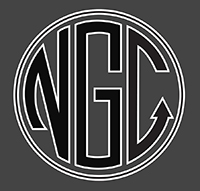
Original Logo

Brightwater Redesign
Redesign Concept
Northern Gi Co wanted a redesign of their logo, adding some character and grit to the brand. We took the lettermark style of the original, and expanded it into a combined wordmark with a stacked monogram, and added the laurels to give an elite feel that better represents their quality and customer base.
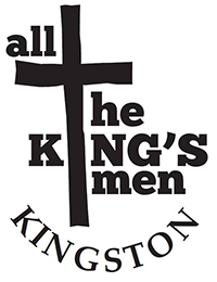
Original Logo

Brightwater Redesign
Redesign Concept
This redesign concept was to assist in the group's goal of reaching a younger demographic by adding grit to the brand. The sword was intentional in that it visually represents a cross, but also acts as a reference to the numerous bible verses speaking about swords (Hebrews 4:12, Matthew 10:34, Ephesians 6:17, Revelation 1:16). The goal was also to create an updated/modern logo that a brand could be built around, including apparel that a younger demographic would wear.
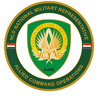
Original Logo
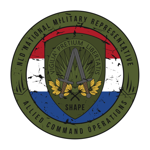
Brightwater Redesign
Redesign Concept
If there was a category for favorite projects of all time, this would be one of them. This redesign was a request from the Dutch Military contingent at Supreme Headquarters Allied Powers Europe (SHAPE), in Belgium. The request was to clean up the overall design to be used for a PVC patch. Both clean and "battle worn" versions were provided and they ultimately went with the battle worn version for their PVC Rubber Patches. The main points of focus were to remove the two tiny flags, replacing them with a single large flag in the background, prominent and proud, which also consoldidated the design over all, as the original felt like two disjointed pieces. The other was to remove or mute a lot of the yellow in the SHAPE crest itself and make that section feel more "tactical" even though the flag has non-tactical colours. Overall the look and feel is much higher quality.

Original Logo
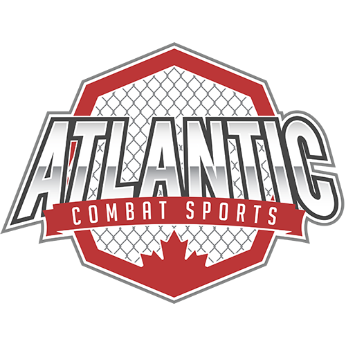
Brightwater Redesign
Redesign Concept
Atlantic Combat Sports reached out to update the logo they received from their previous designer. They wanted something that they could build their brand around, and that spoke more to the combat sports community that they engage with. The original was a lettermark style, but for the redesign the goal was to make it a little bit more dynamic, with a wordmark stacked on an octagon fighting cage. The cage is rotated in an atypical orientation, which also allowed good placement for the maple leaf at the bottom as a national identifier.
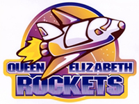
Original Logo
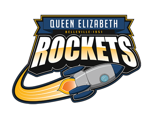
Brightwater Redesign
Redesign Concept
This was for a school which was never used because the school was torn down. This is a favorite in the redesign category! The idea here was to update the original as a modern logo that would work really well for the school's sports teams, while improving the feeling of "momentum" that the rocket had in the original. Big fan of the "retro futuristic" feel of the rocket in the redesign.
Original Logo

Brightwater Redesign
Redesign Concept
The redesign for Core Athletic Gear was about adding some complexity to the logo, in a way that worked. The original almost felt like two separate elements, so the redeisgn stacked the elements together and integrated them within the wordmark to make it more cohesive.